Hi all. I’m working with 2 shops (NA and EU). The mock-ups look excellent overall, except for the Kids shirts in the EU shop. What’s the issue? The ratio of design size to shirt size is VERY disproportionate, and as a result deceptive to potential buyers. It’s so poor from my perspective that I’ve decided for many of my designs to just not offer Kids shirts. Is this a known issue? Are my eyes deceiving me? Is a solution in the works to fix this? I hope bringing some attention to the matter is a step in improving Spreadshirt. Thank you in advance for any feedback.
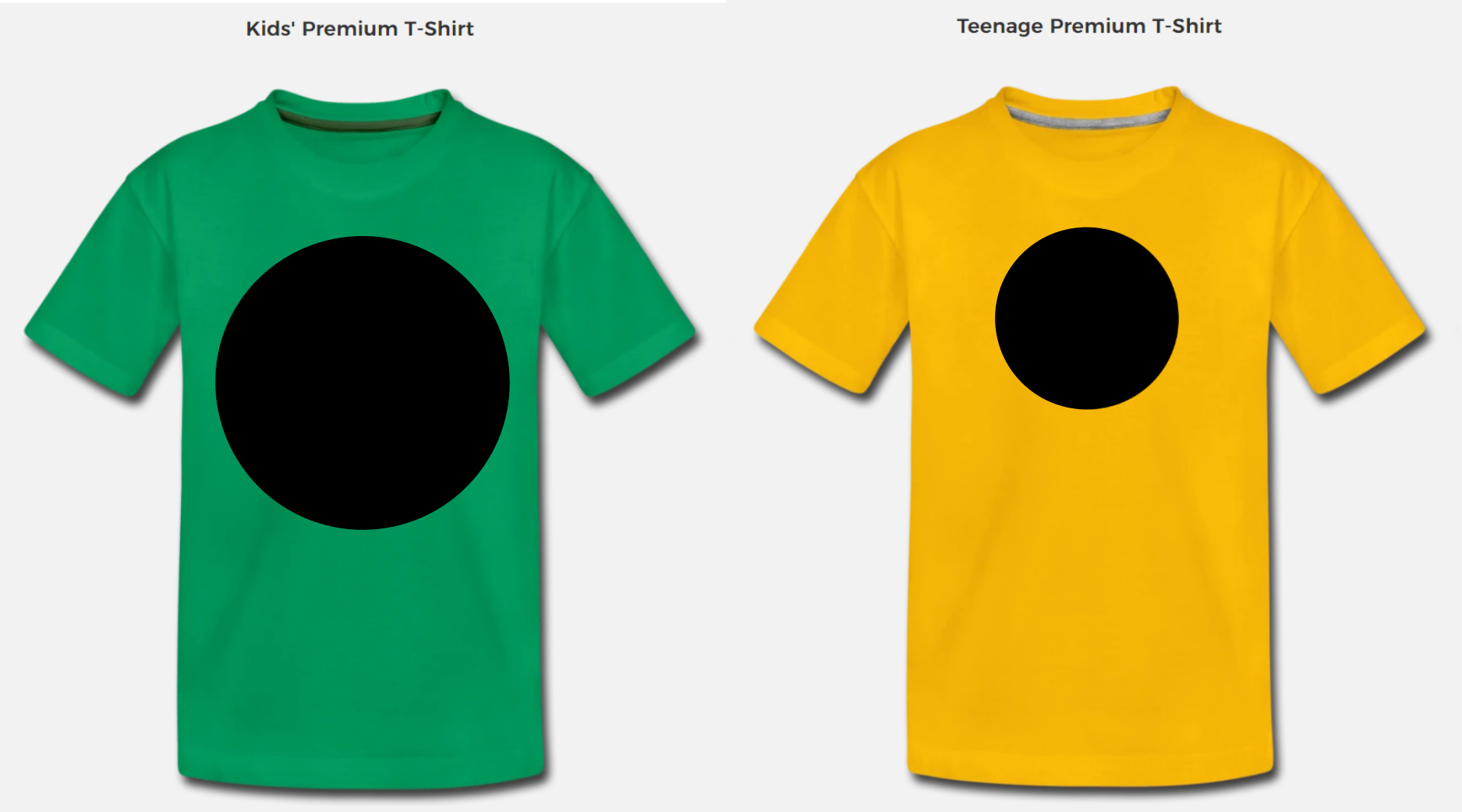
Example image below compares a Kid’s Premium T-Shirt to a Teenage Premium T-Shirt with a 6-inch diameter circle design in both cases. Again, this example is specific to the EU shop mock-ups (Teenage T-Shirts aren’t offered in the NA shop)